Project Overview
Team Role: UI/UX Designer
Time Period: October 2024 - June 2025
Through: UCI Video Game Development Club
Underwatertale is an underwater themed exploration game where you play as a boy who has mysteriously turned into a fish who is trying to return to the human world! Solve puzzles, meet quirky characters, and explore fun environments! I had a lot of fun working on this project as I loved the ocean theme, and am also a fan of exploration and puzzle games. This game was originally meant to last only a quarter or two, but it snowballed into a yearlong project, with the team currently exploring options for launching the game more formally! Check out the game’s itch.io page!
Overview
I started work on this project the very first quarter it was pitched, so when I began almost no concept work for the game had been done. The first thing I did was discuss with the team lead what kind of game experience he was aiming for. Since the focus of the game was supposed to be on the environments, we wanted to keep any HUD elements minimal, but the rest of the UI was allowed to be more playful to suit the tone of the game. The art team put together a style inspiration document, which was helpful for me to get ideas for designs from, but I did end up putting together my own UI specific inspiration document. This page will detail the design work I contributed to the project, and it will be split up by element rather than a specific timeline, as we altered a lot of things about the game as we went. Some things may be different in the final game, all that is shown here are my personal contributions to the project.
Color Scheme
Seeing as the game was going to take place underwater, there was going to be a lot of blue in the on-screen environments. This is why a lot of the UI elements are orange, or other warm tones that stand out against the environment well. A notable exception here is the speech "bubble", which is detailed in the next section. I wanted the off-white, orange, and reds to mimic the color scheme of the player character, a little orange fish.
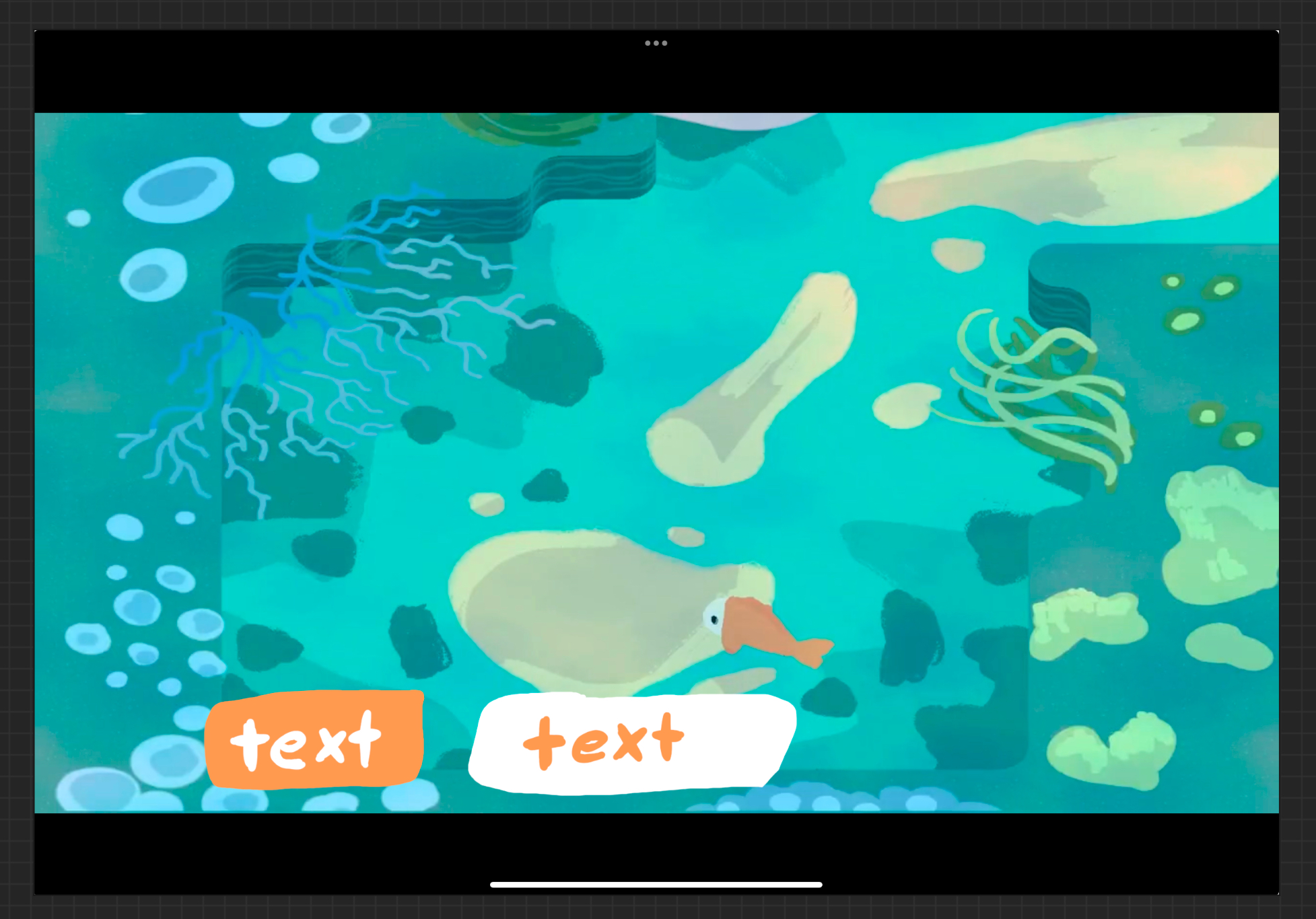

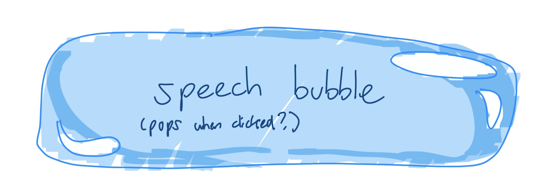
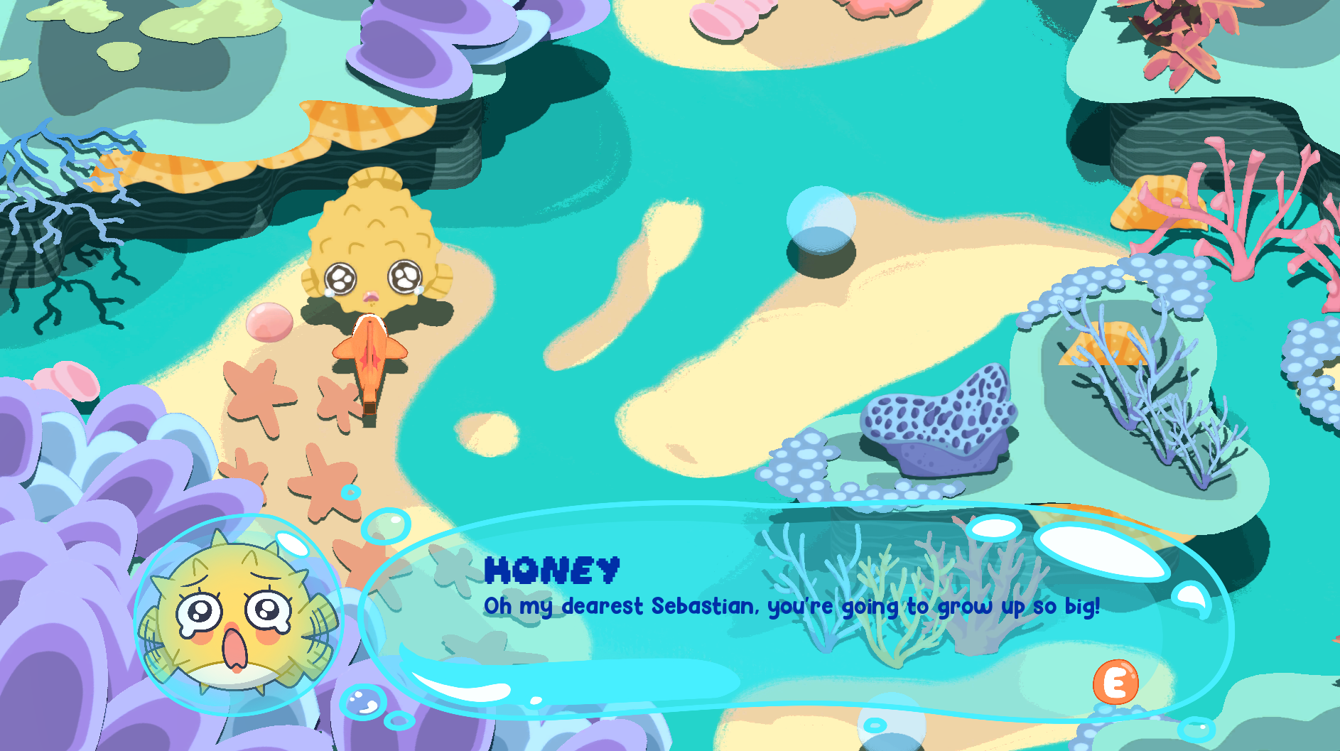
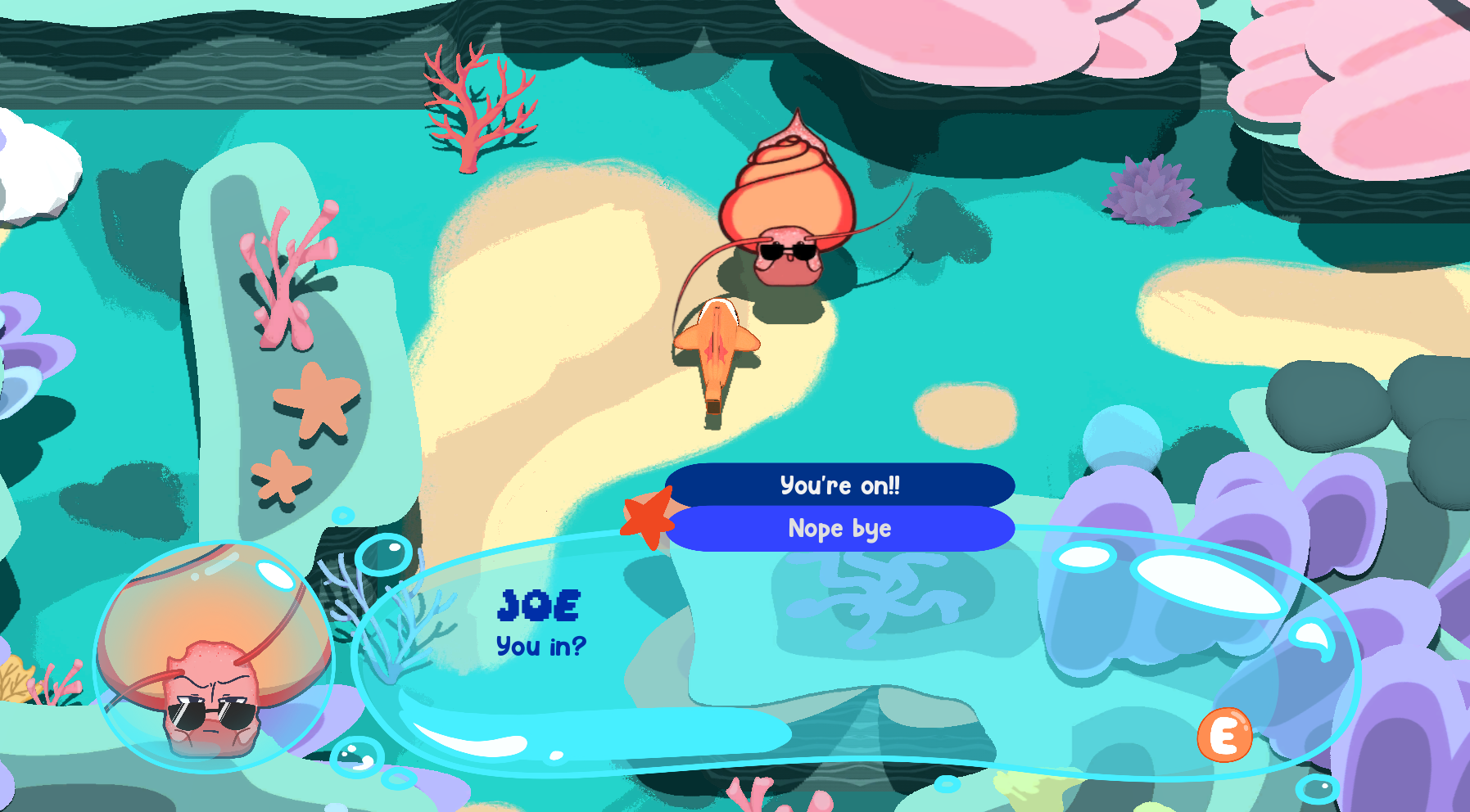
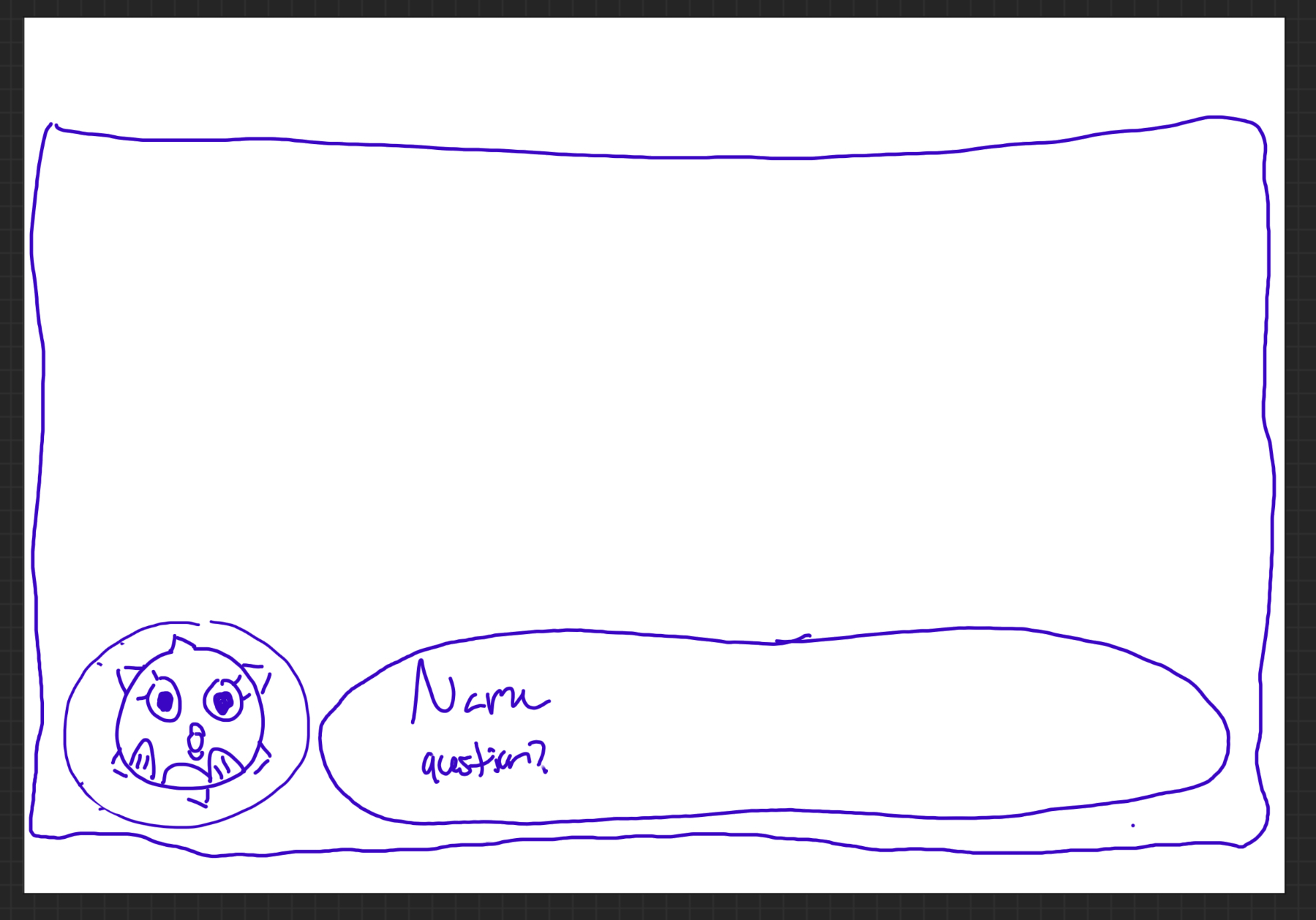
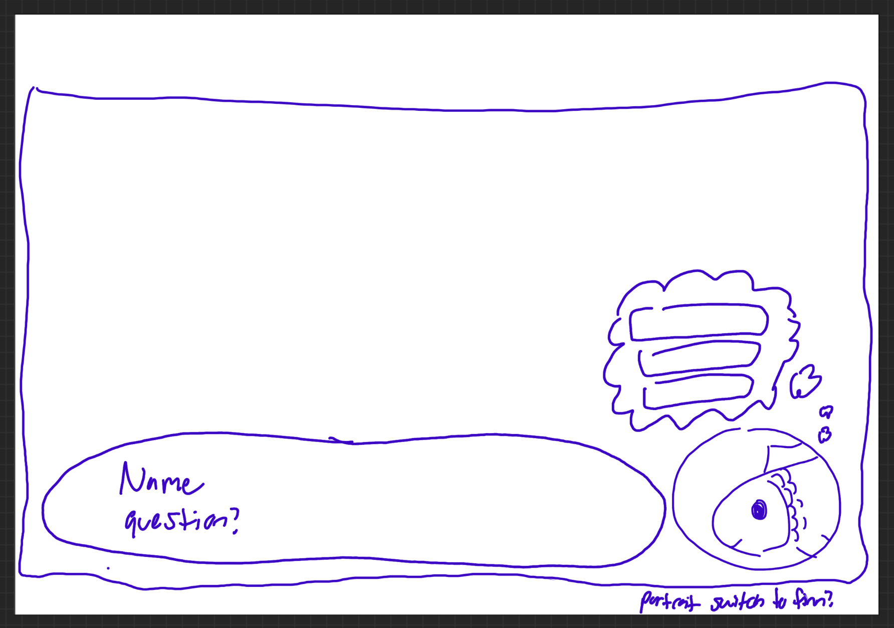
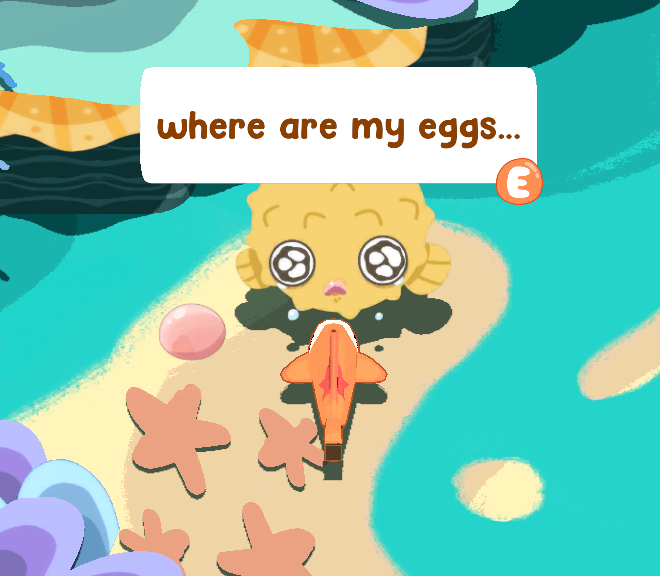
Speech bubble
The team established pretty early on that this would be a character-driven game with a lot of dialogue, so I needed to design the text bubbles the player would see when talking to characters. My idea was to have the text appear in an actual bubble, which the whole team liked. The team and I also decided that a character portrait would be shown to provide more expression to the player so they could more easily tell the emotions of the character they were interacting with. This speech bubble concept did not need a lot of iteration, but I did play around with the orientation of the portrait bubble relative to the text one. The final decision was to keep it on the left, as the text will be read left to right and I did not want a player to accidentally skip over the dialogue portrait. The bubbles would not overlap so as to not take up too much screen space.
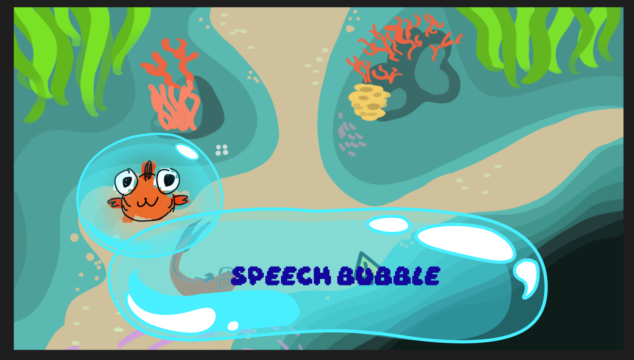
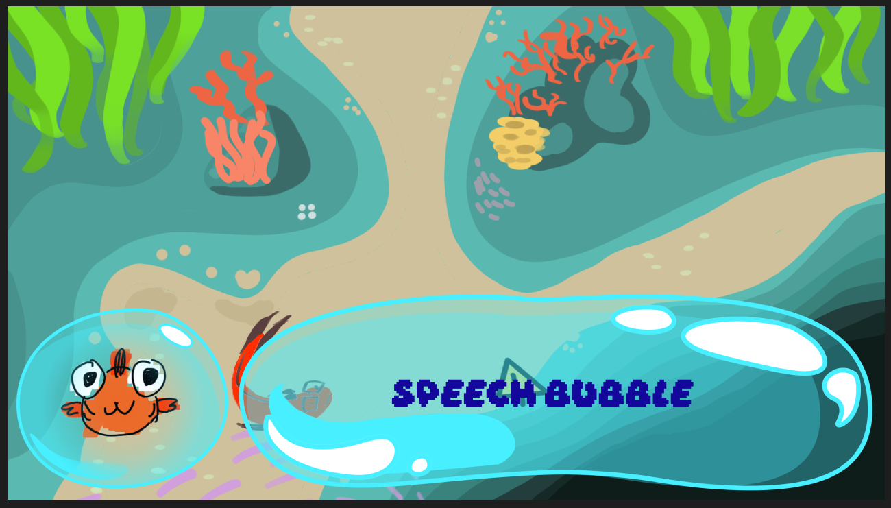
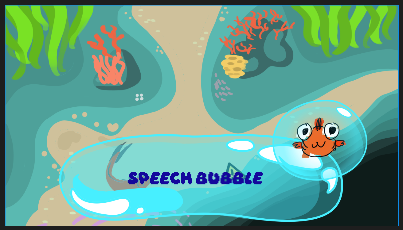
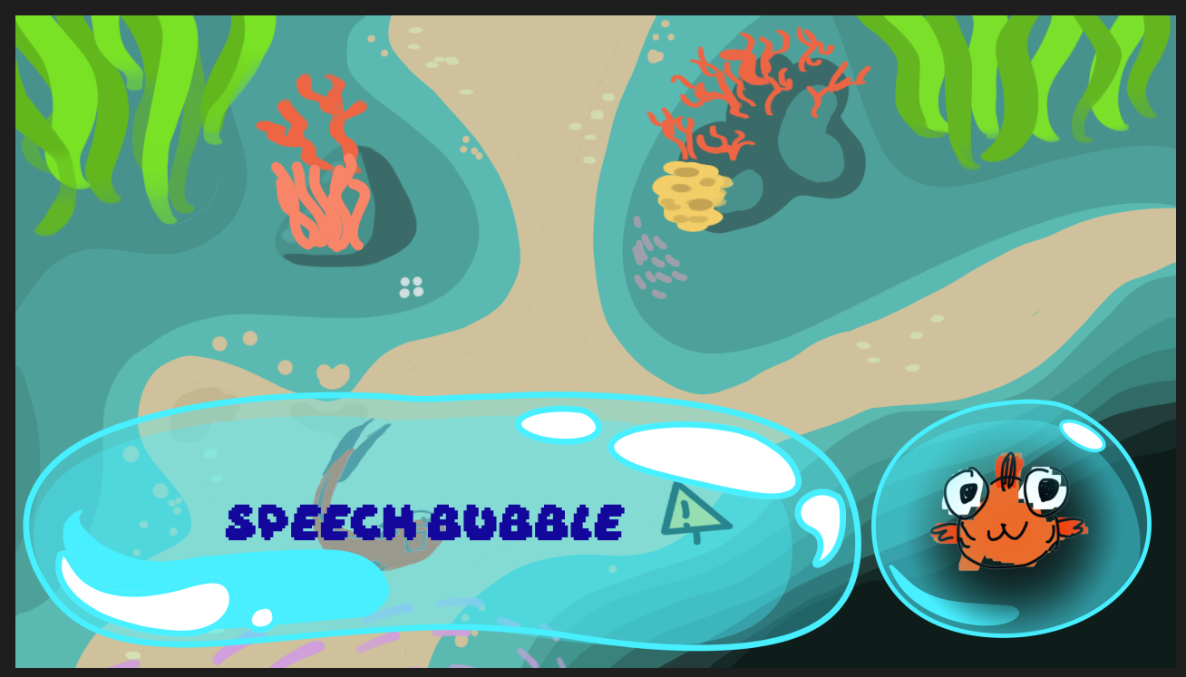
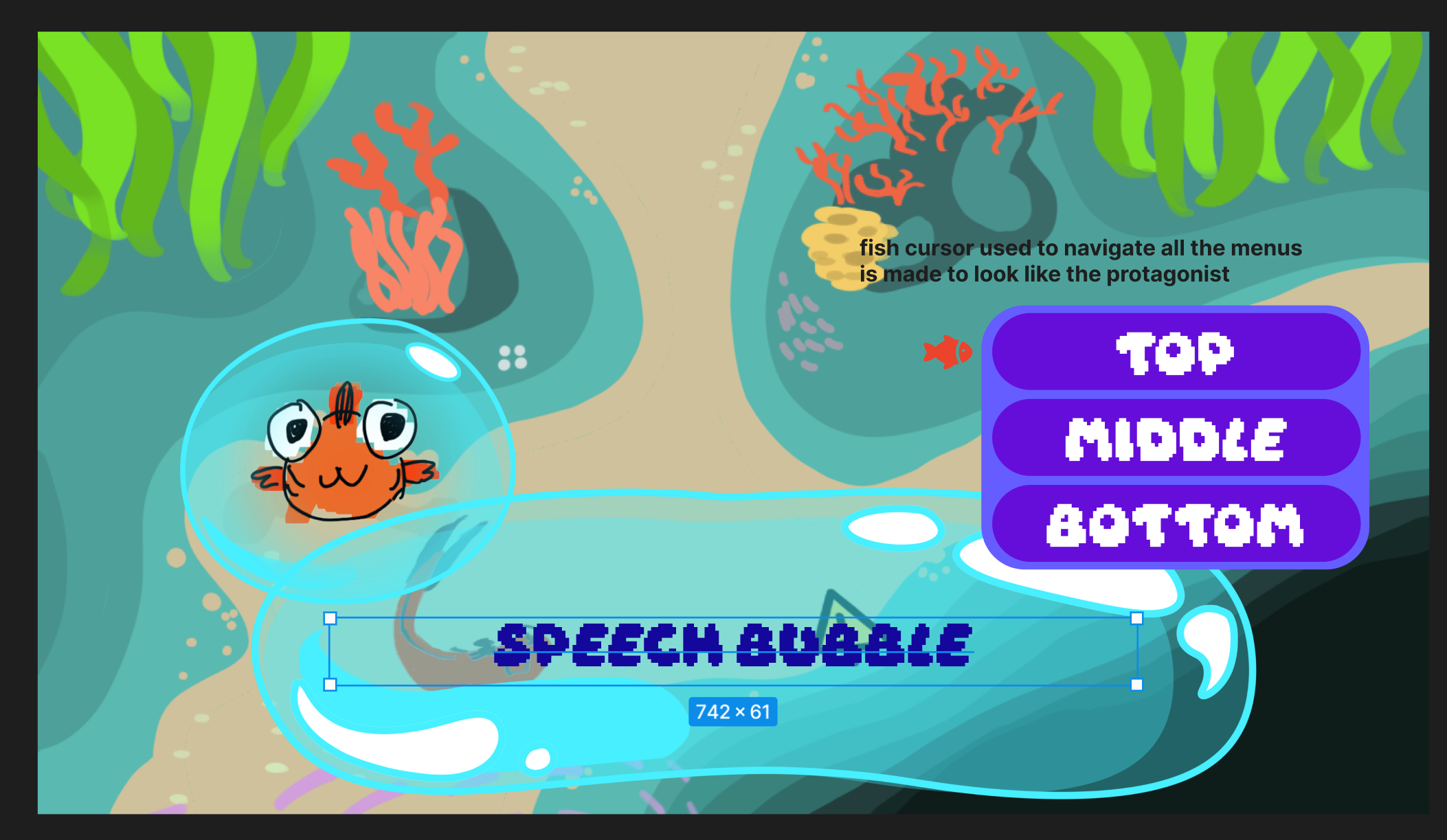
My initial mockups for the speech bubble. The final version (seen below) is more elongated, and I chose to use 2 different fonts for the character’s name and their speech so they were easily distinguishable. A small prompt at the bottom right lets the player know to press “E” to progress.
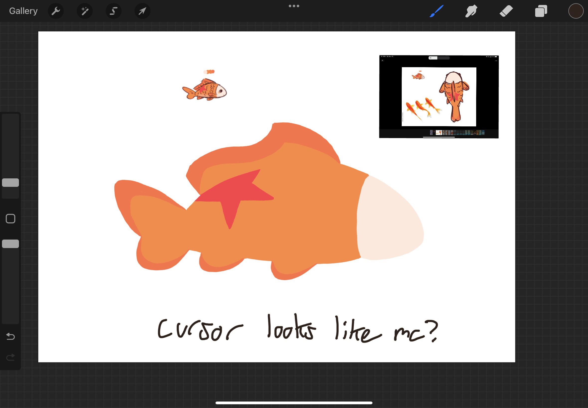
I also had to decide how character dialogue options would be displayed. Below are the mock up and final versions. The final version has smaller text to fit with the dialogue text size, is blue to better match the color scheme, and the surrounding color around the options has been removed. The option that the player is hovering over turns dark. Initially, I had this idea where a cursor shaped like the player character could be used throughout the UI, but the team and I discovered that the drawing I made was a bit too detailed in practice. Instead, a star cursor, similar to the star on the protagonist’s back, was used.
As a bonus, when considering how to display dialogue options, I considered having a little thought bubble come out of the main character’s portrait, but a few issues with it came up so it was never implemented. I had the idea to have the text box be animated and drift to accommodate for the other portrait, but the rest of the team pointed out the movement of the text box could be distracting, or even make people motion sick if they were skipping through the dialogue, which I agreed with. Additionally, I was thinking the thought bubble may take up too much space on the screen and would be distracting.
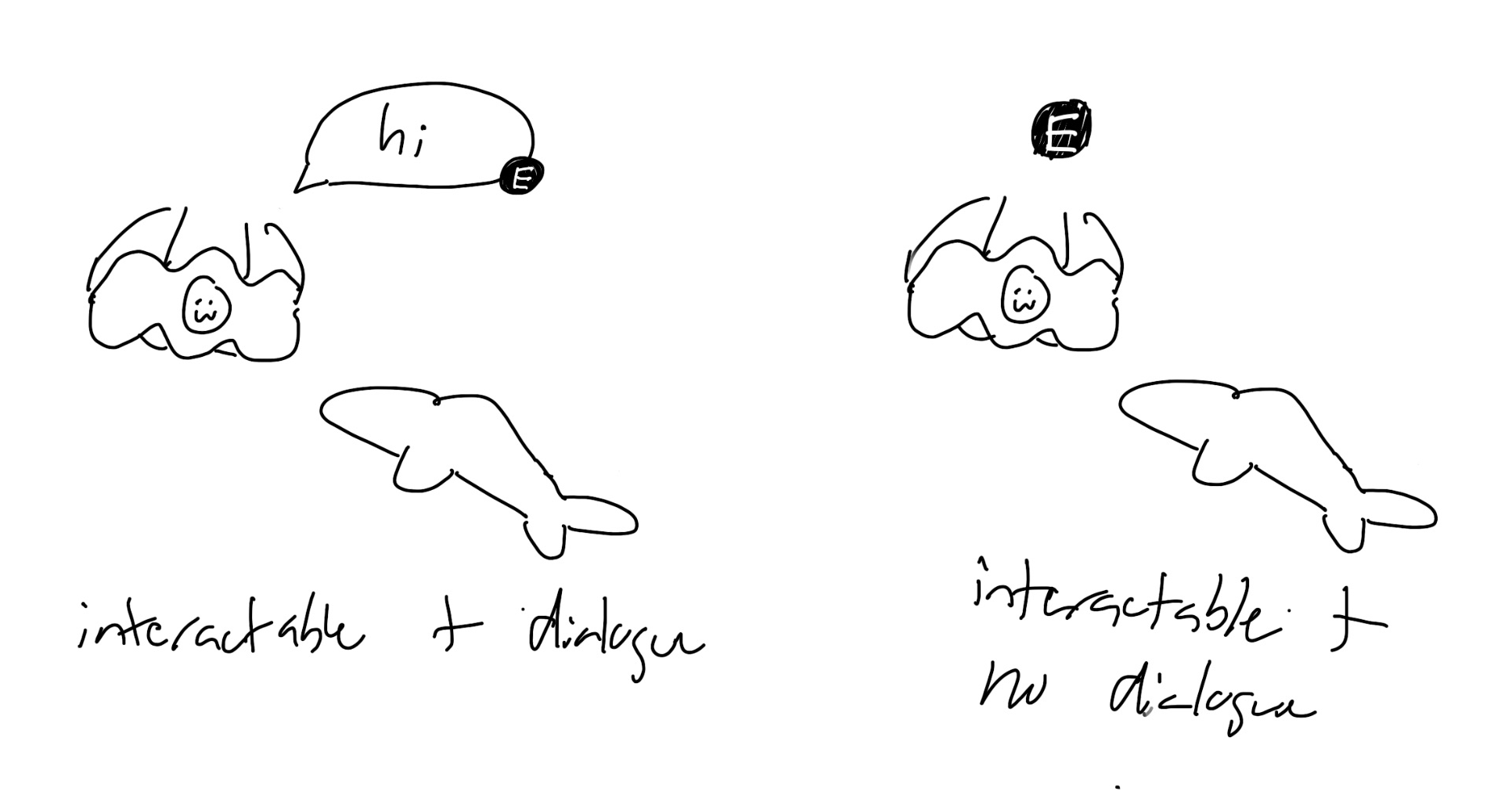
Interaction Prompts
While playtesting the game for the first time, the team discovered that even though we had a small sign detailing the controls, people did not know how to interact with the NPCs! I got to work on designing a solution, which was to have small prompts letting the user know what button to press. A team member wanted the characters to be able to have a smaller dialogue box the player could see without entering into a conversation, so I designed that as well. Here are the mockups and final versions! In the next playtesting session, players were able to more easily interact with the NPCs.
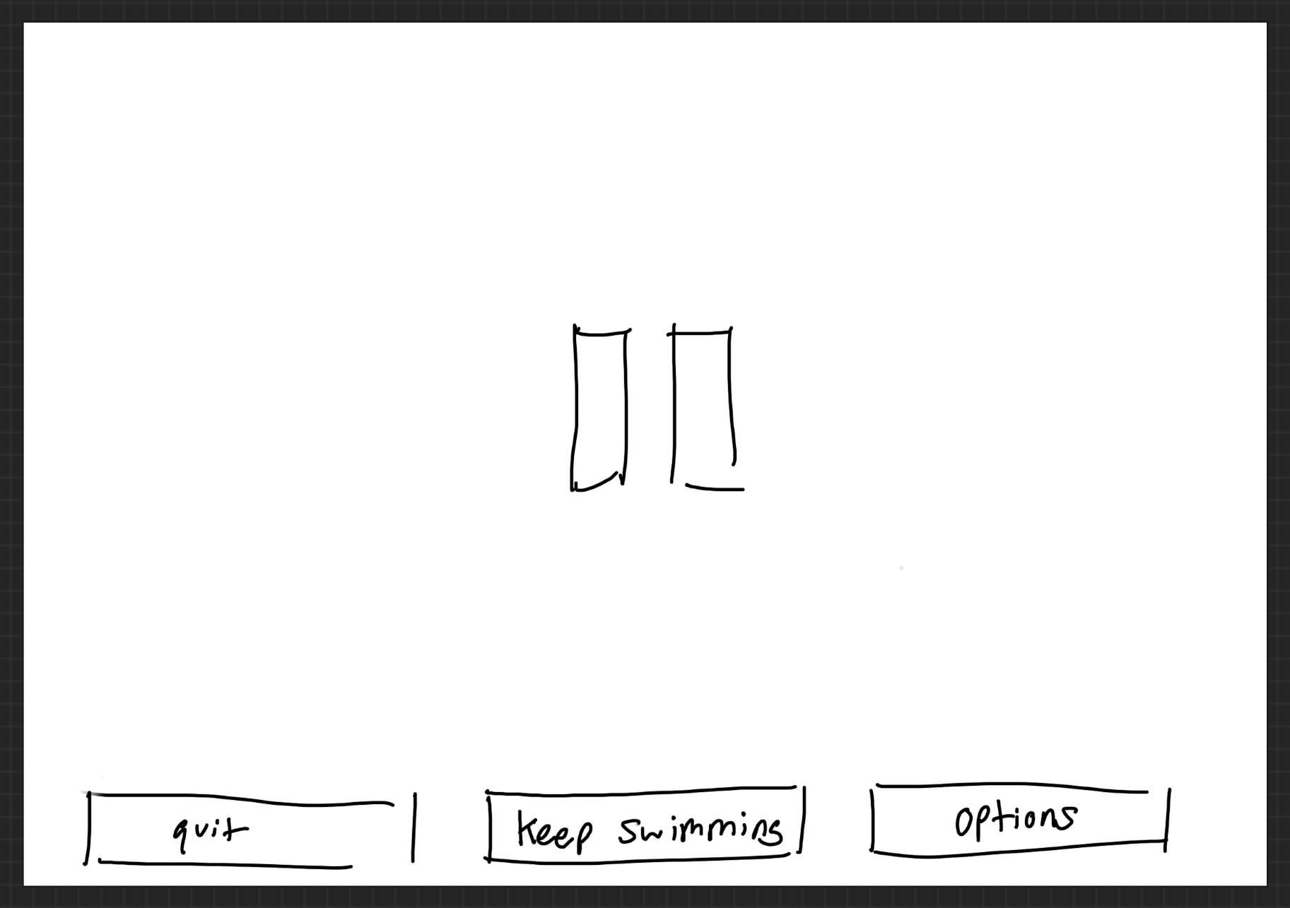
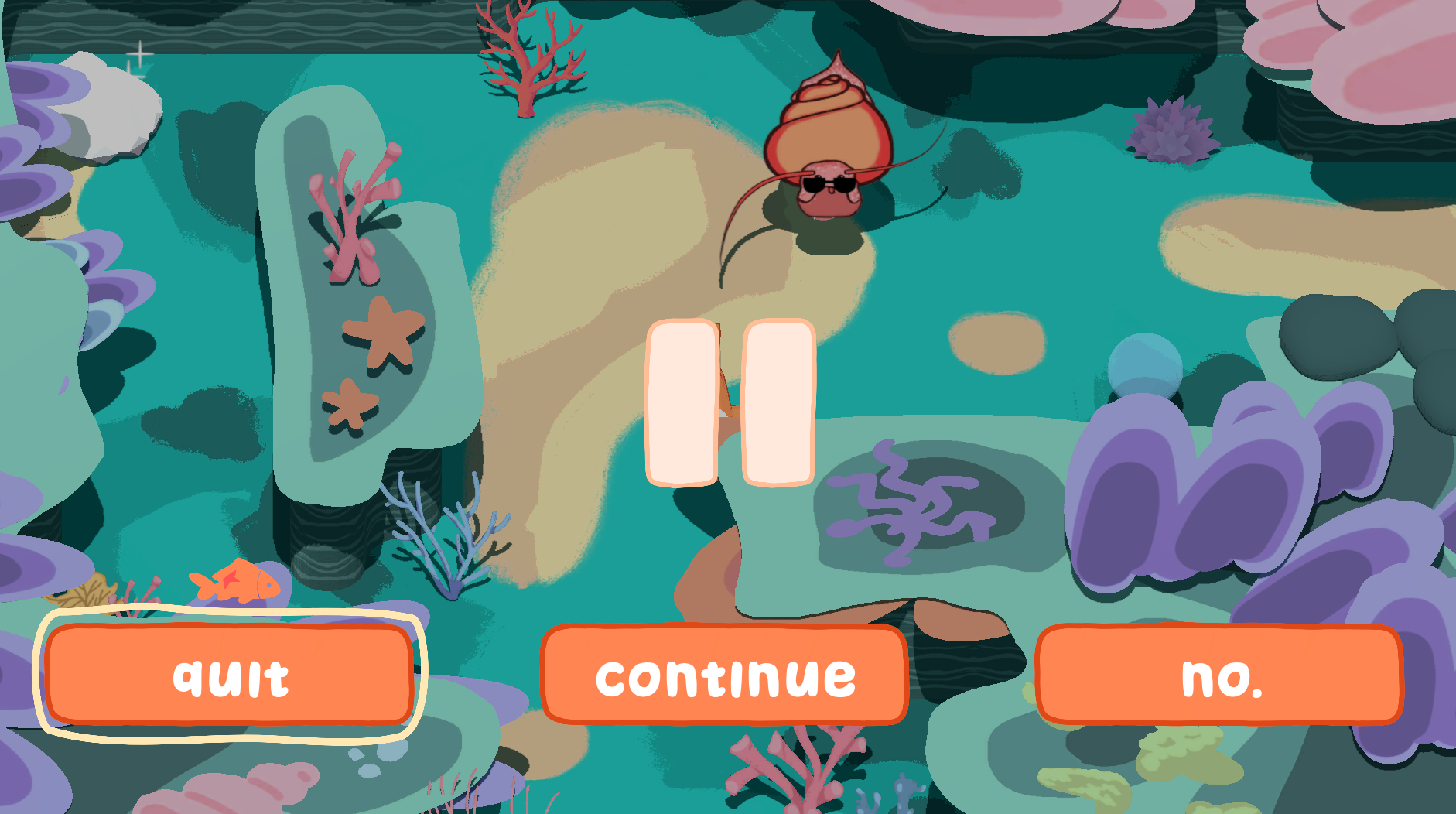
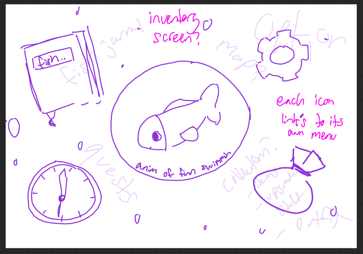
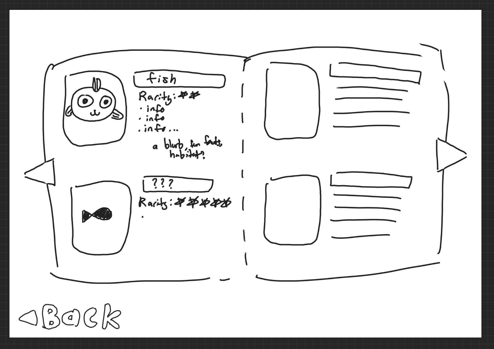
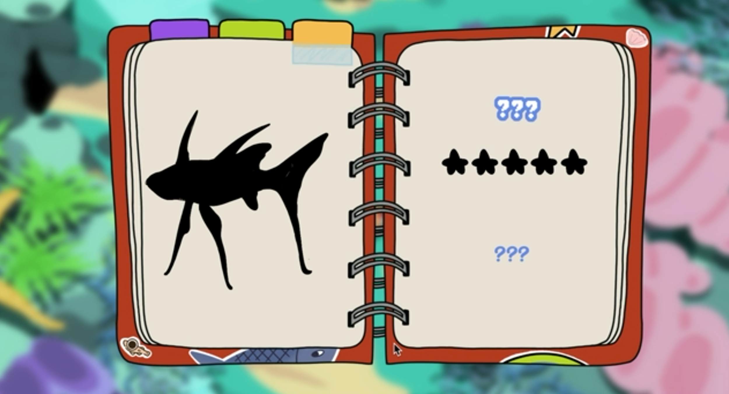
Pause Menu + Inventory
Finally, the last large UI feature I helped design was the pause and inventory screens. The team wanted the inventory to be used for keeping track of items gained, equippable cosmetics, and fish caught in a fish rescue minigame. While listening to one of the discussions on the game’s story, the idea of the main character keeping track of his journey in a journal was brought up, and I had the idea for the inventory space to be that journal! It would have some personality, and fit the story of the game as well. Some later versions of each screen as well as initial mockups are provided. My teammates have also contributed to the journal, so the design in the final game may be different.

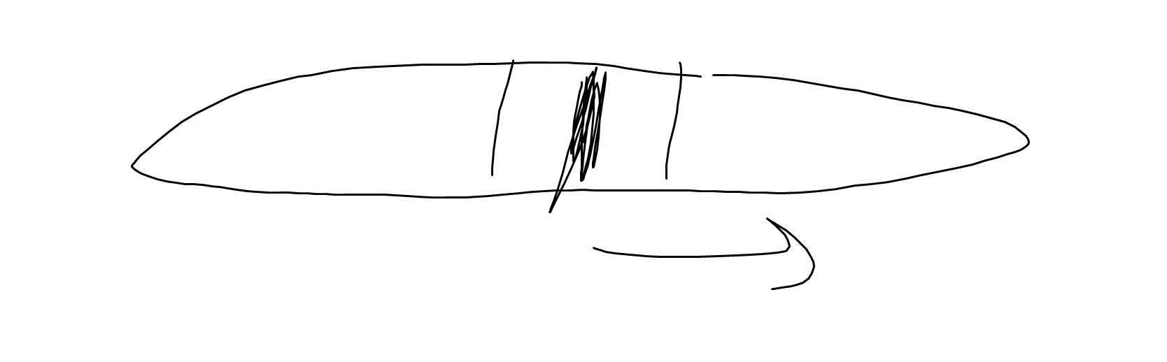
Bonus Concept Art
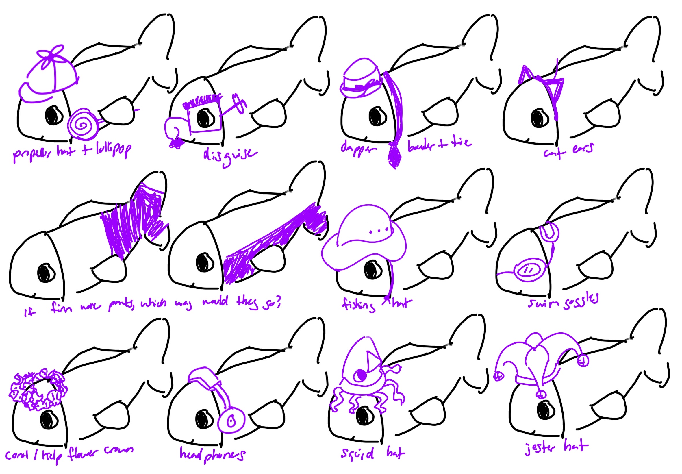
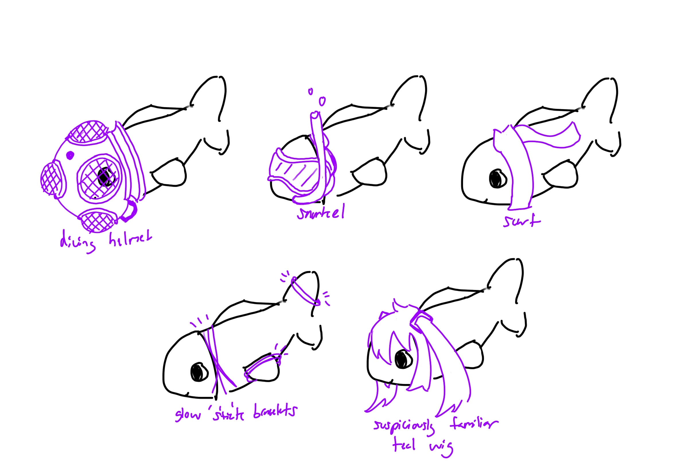
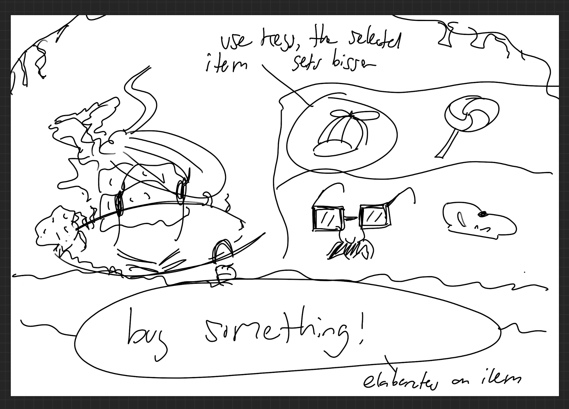
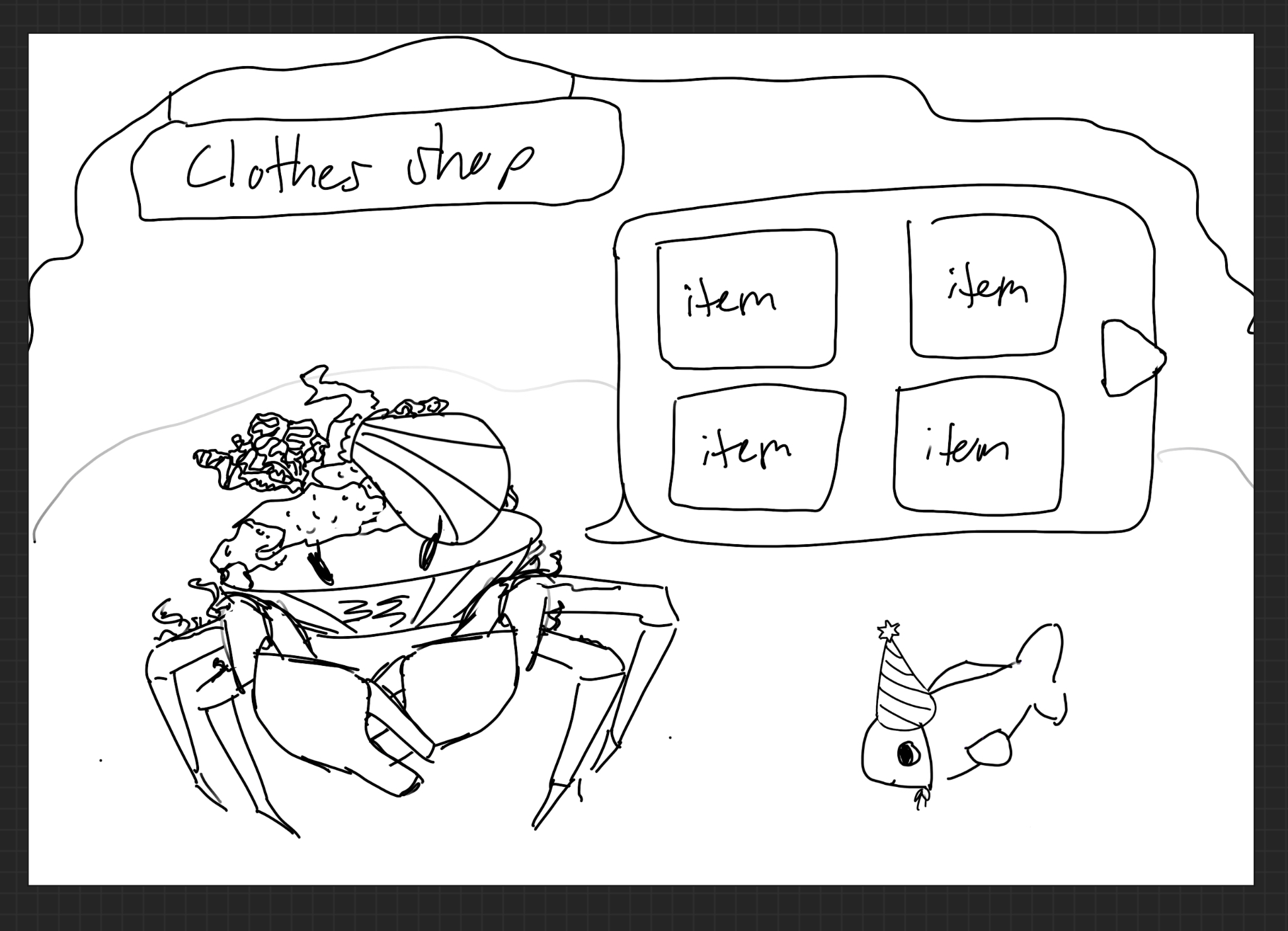
My concepts for unlockable costumes and a shop to purchase them
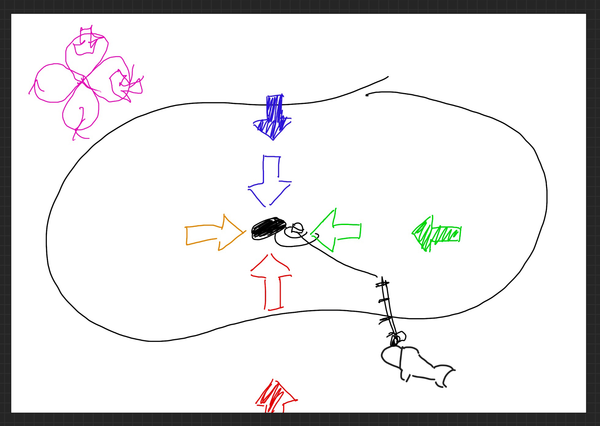
Brainstorming the fishing rescue minigame with a teammate
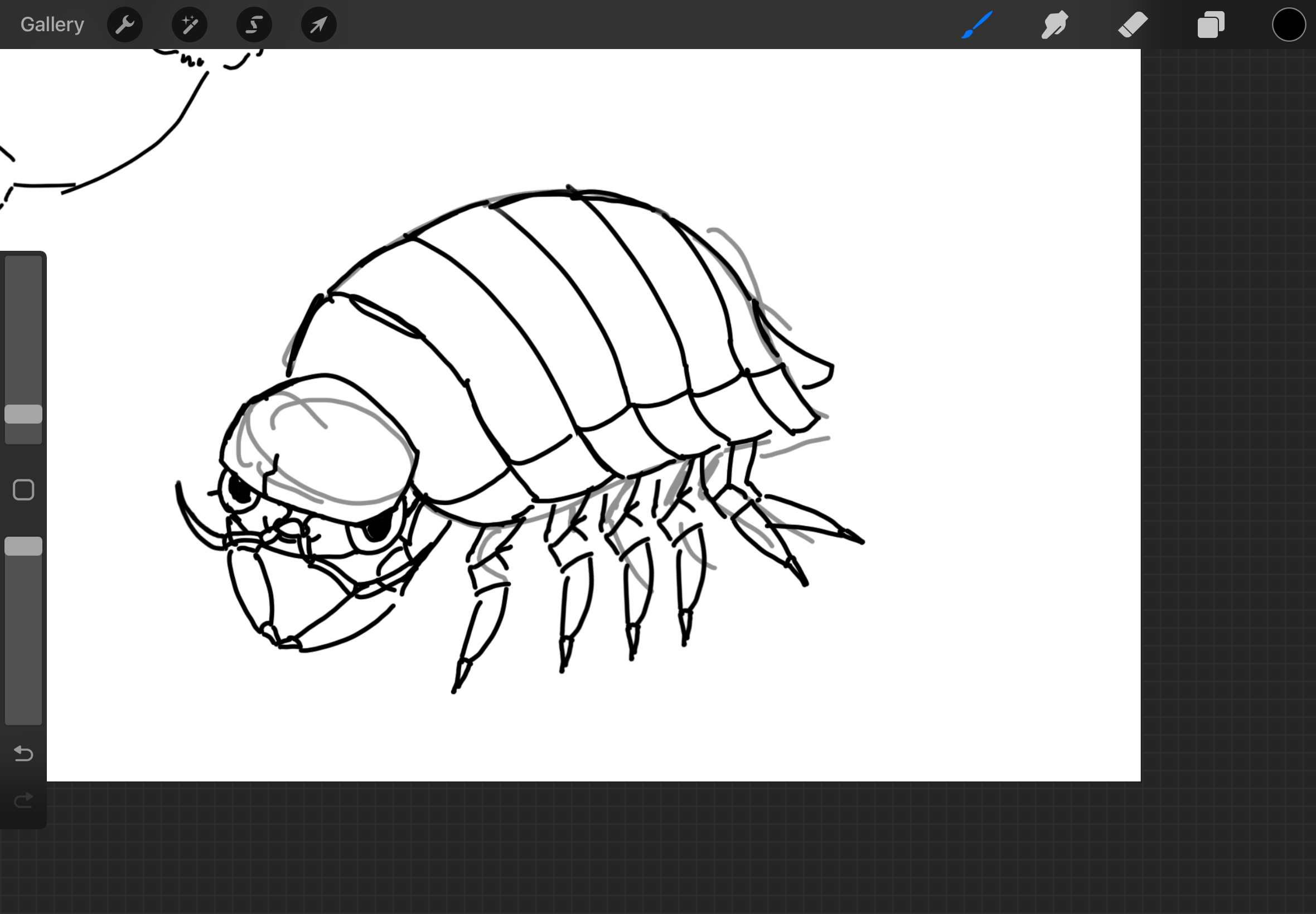
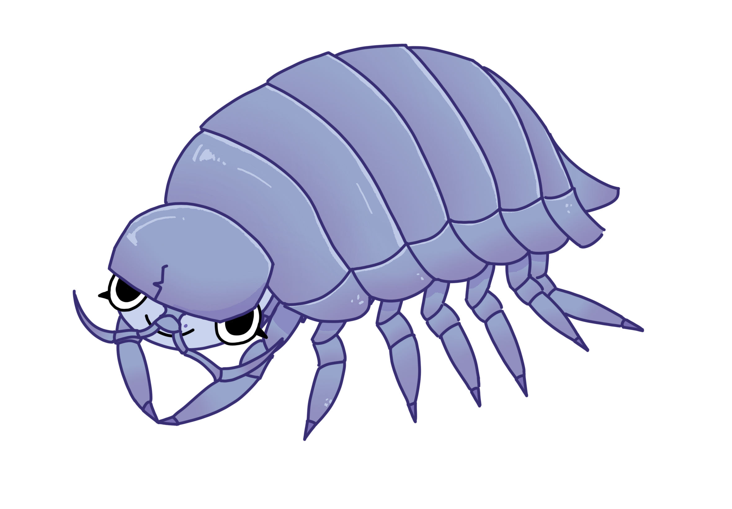
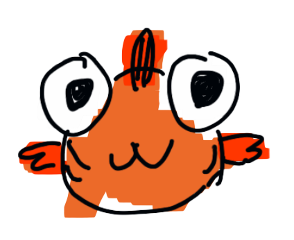
My teammates and I each made sea creature characters of ourselves to fill out the fishing minigame, so here is mine: the Izoepod!
Thanks for reading!